

サイクル用品商社の販促物一式
2015
Client : インターテック(東京)
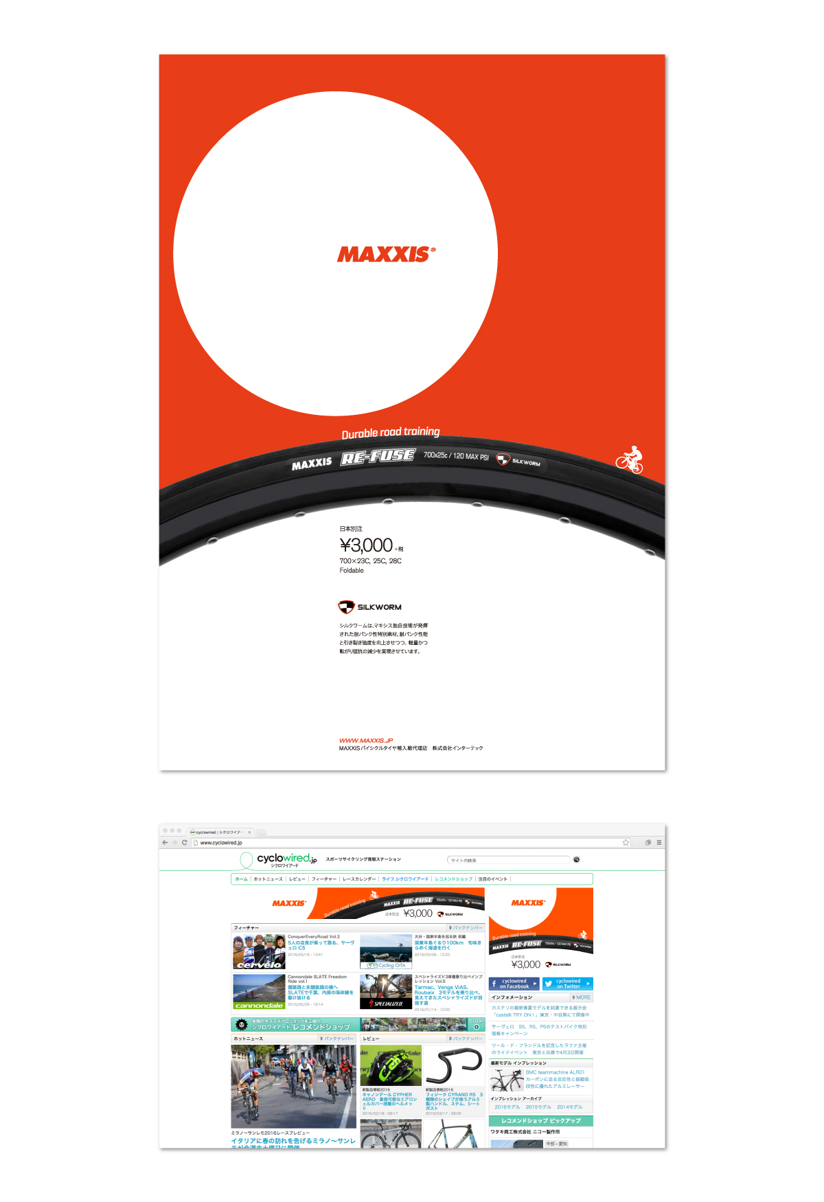
海外ブランドのサイクル用品を輸入販売する商社「intertec」。SKG株式会社では、取り扱いブランドの日本向け総合カタログ、日本版店頭POP、雑誌広告など、一式担当しています。
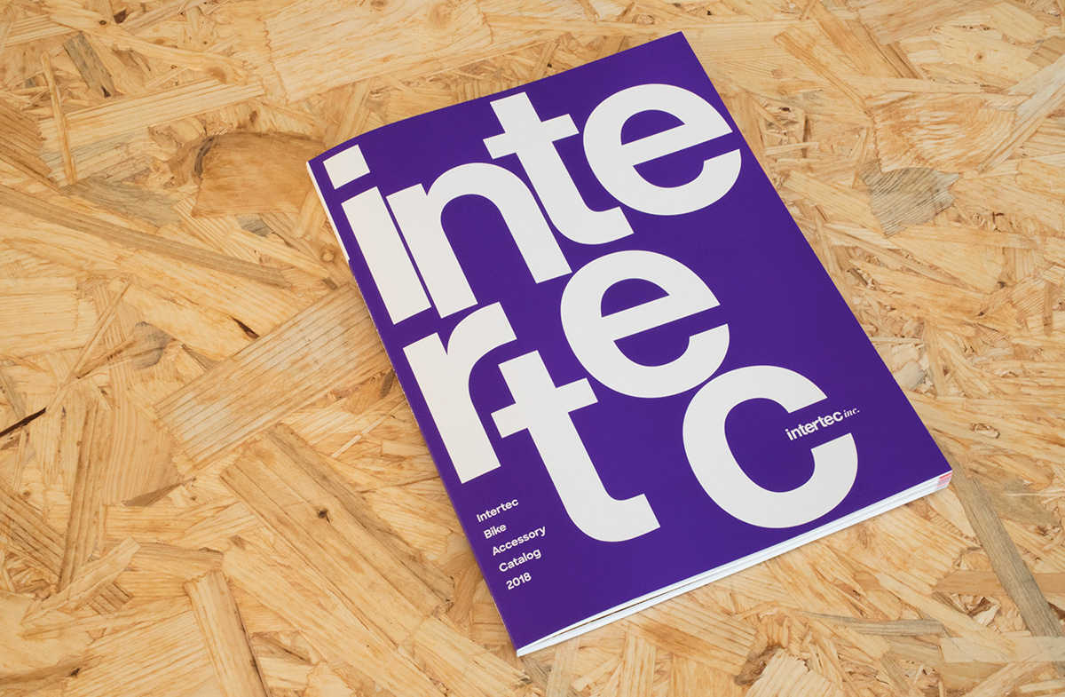
2018年のカタログはどういったものにするのか、去年のものとはどう変えるのか、それらを固めるために会社のアイデンティティについても議論させていただきました。社名の由来、コーポレートカラーの選定理由、業界内でどういったポジションを目指すのか。その議論の過程をカタログ表紙のデザインに反映させました。intertecのロゴデザインを分解し、ふたたび組み直すデザインで表現しています。
Promotional materials of cycling products trading company:
“Intertec”, a company that imports and sells cycling products of foreign brands. We have taken part in the catalogs, the displays at stores, and magazine advertisements.
To design the new catalog for 2018, how to change from what it was earlier, we had to argue and define the identity of this company. The origin of the company name, the selection reason of the cooperation color, what kind of position the company was aiming in the industry; these were the elements we included to design the new catalog cover page. We put into pieces the logo design of “Intertec”, and designed by rearranging it.
- Printing Info
-
カタログ2018
【表紙】用紙:JETスター/印刷:表1色 蛍光混ぜ特紫・裏0色/加工:マットPP
【本文】用紙:b7トラネクスト/頁:120/製本:アジロ並製本