すしべん 亀有店
2018
Client : 若廣(福井)
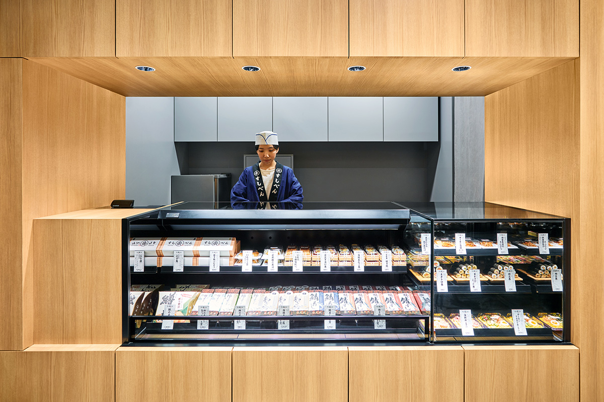
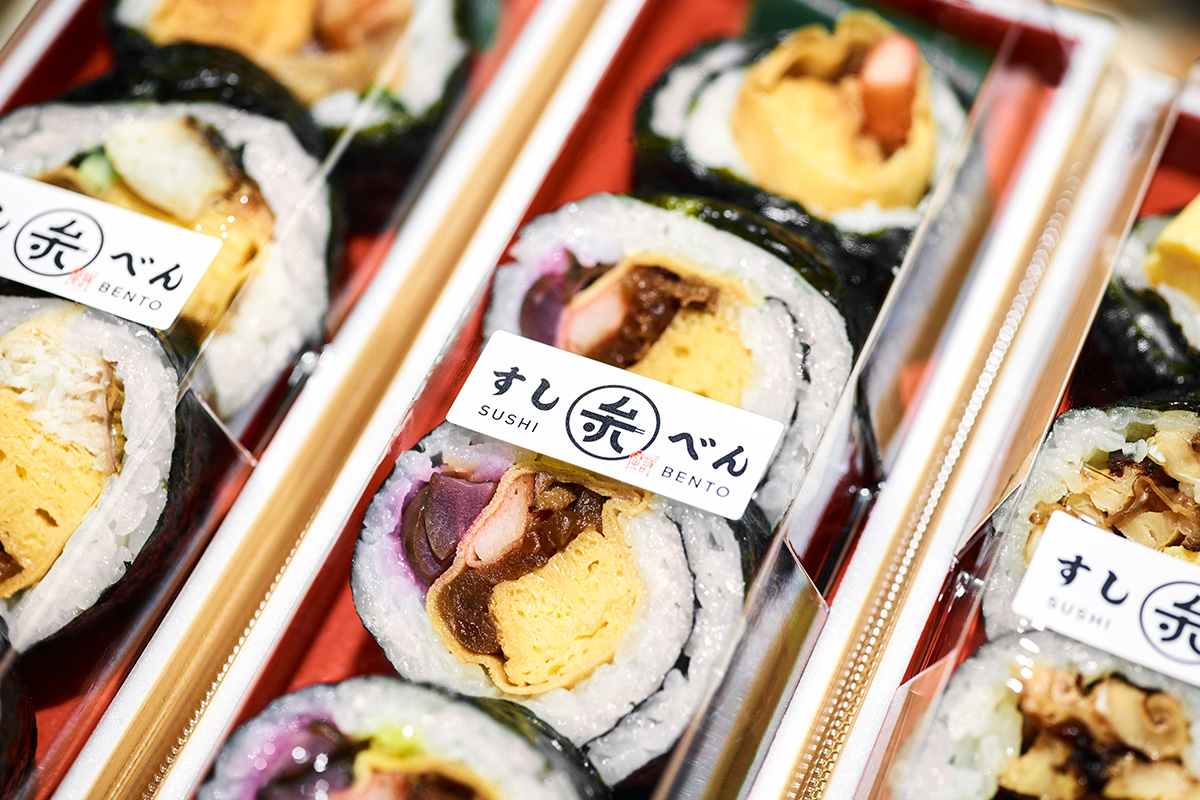
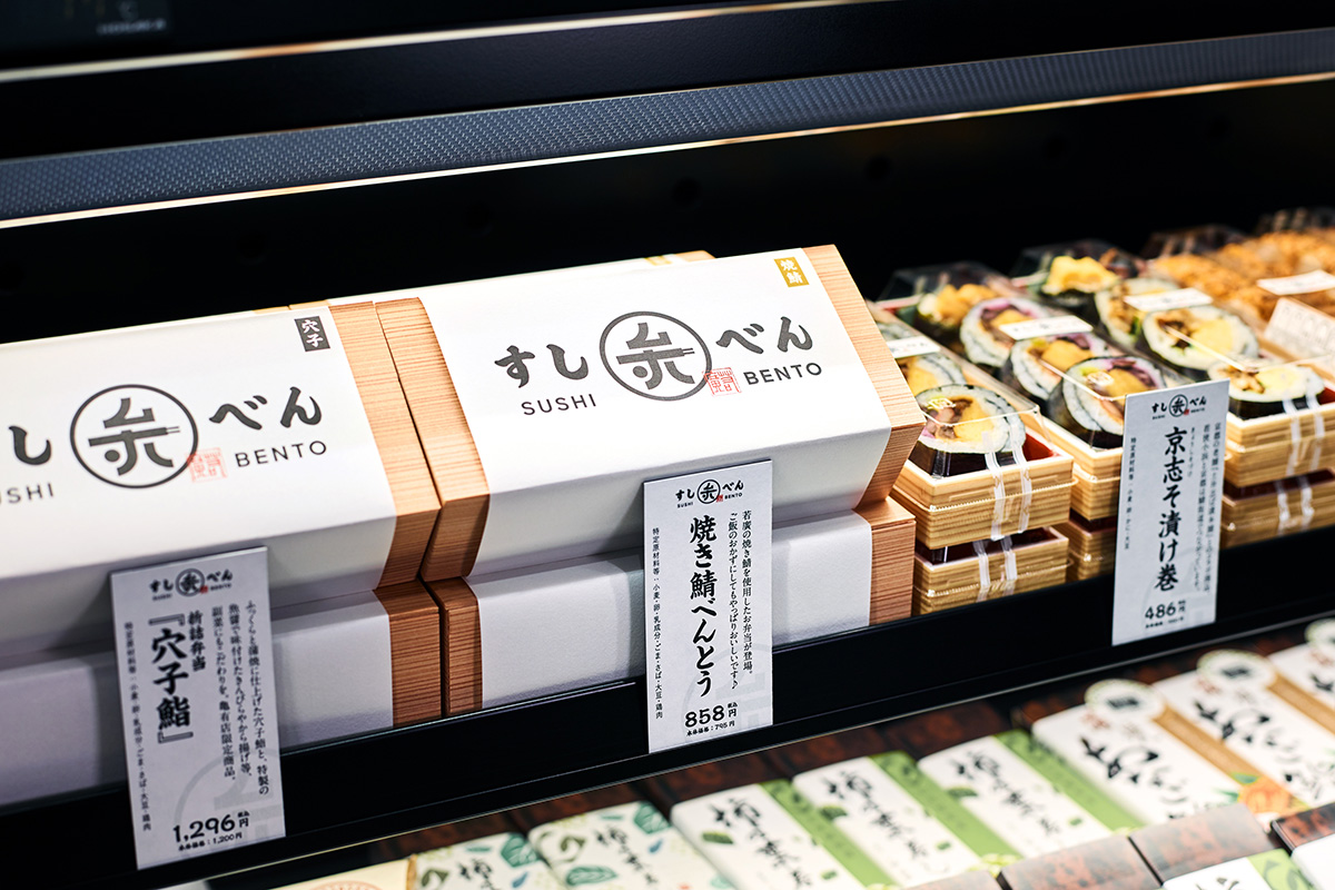
熟練の職人が手がけるお寿司を、弁当感覚でもっと身近に、もっと気軽に手にとってもらいたい、という思いからスタートしたブランドです。クライアントは今や棒寿司の定番と言える焼き鯖すしの生みの親「若廣」。今度は「すしべん」で寿司弁当の新基準を生み出します。
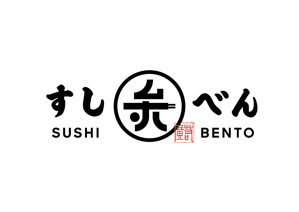
シンボルマークは日本固有の文化である家紋をモチーフに制作。平仮名の「す」「し」、漢字の「弁」や「巻き寿司」、「お箸」の要素を一つの形に落とし込んだデザインに仕上げています。
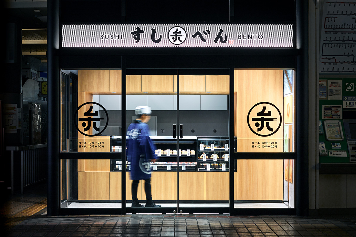
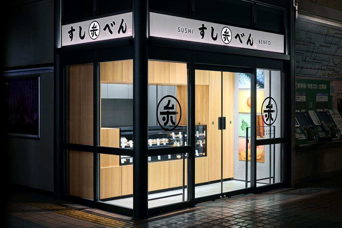
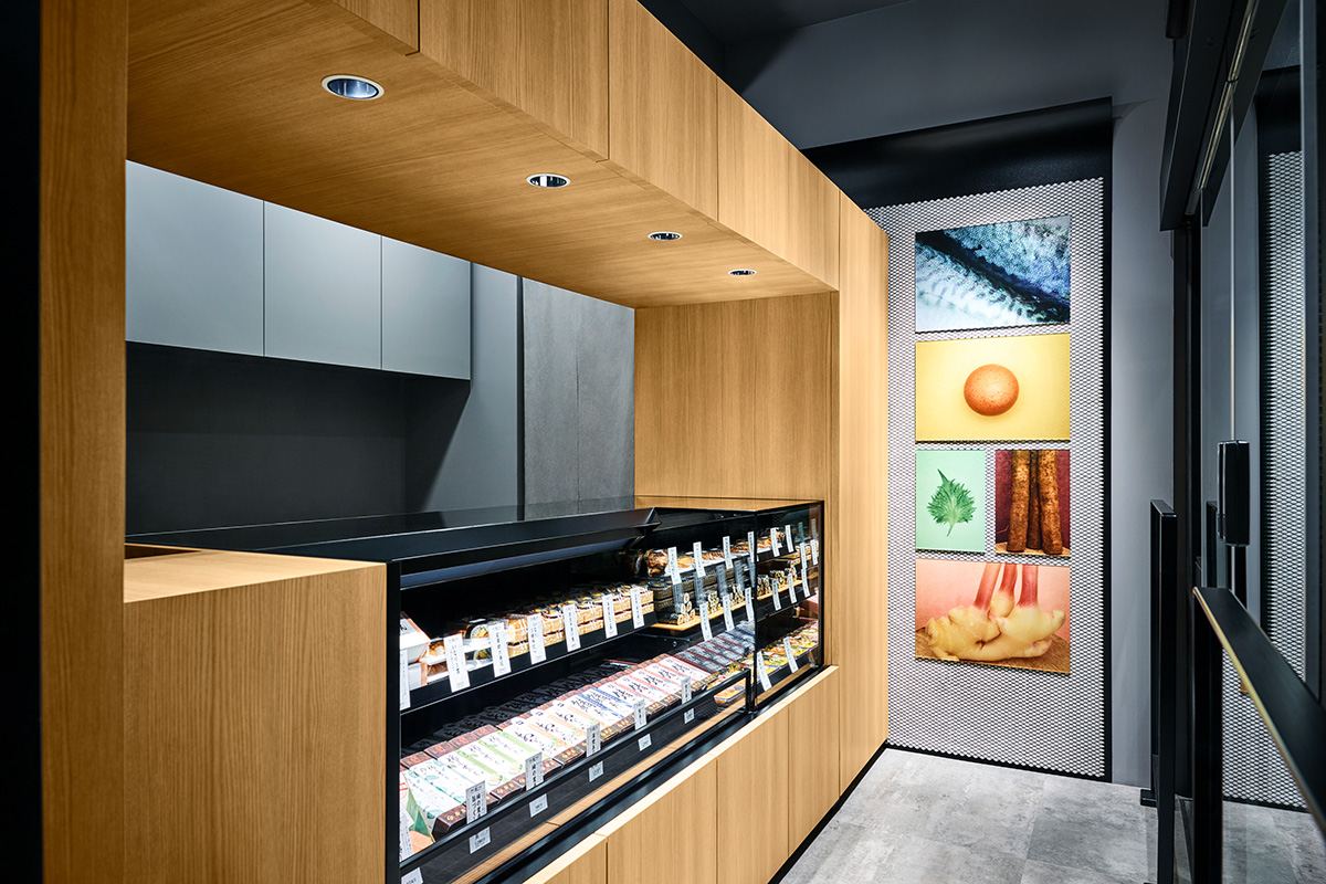
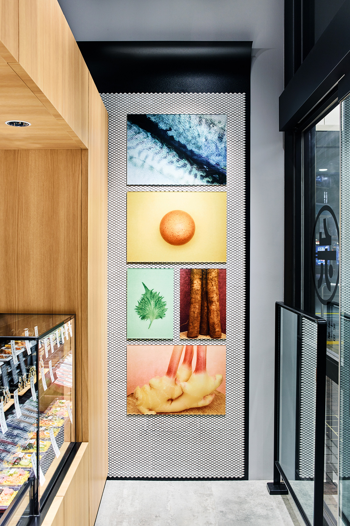
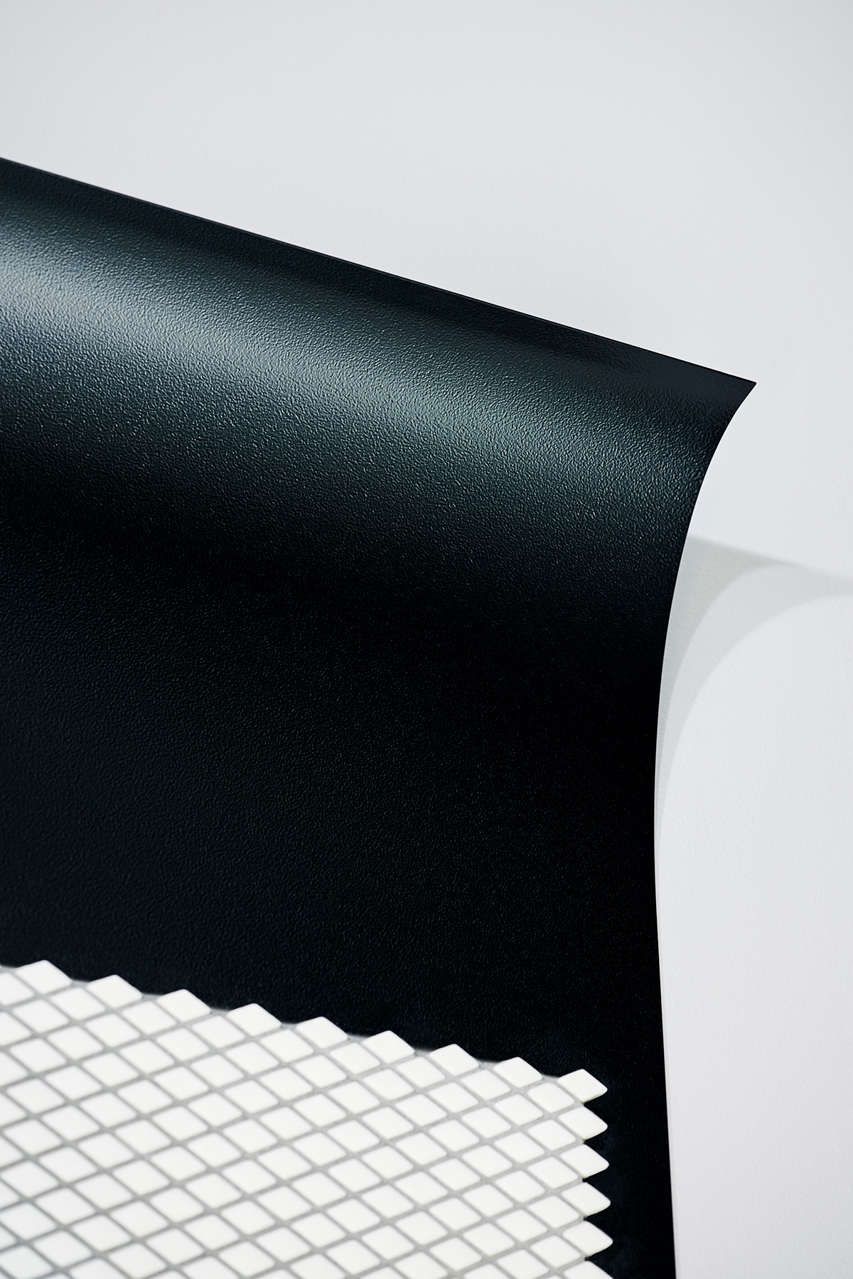
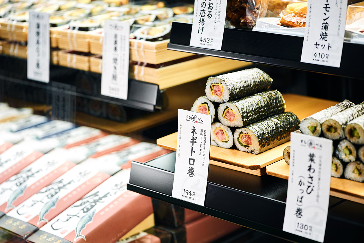
また店内内装では、壁に黒い鉄のシートと、その上に白いひし形のパターンタイルを設置。それぞれ海苔巻きの「海苔」と「お米」を表しています。さらにその上に「具材」の写真を配置し壁面のディスプレイで海苔巻きを表現しました。それらは華やかさを演出すると同時に、駅構内という人通りが多くスピード感ある場所で、お客様の目を引き止めるアイキャッチとしての役割も担っています。
Stories『新たな定番になるためのブランディングデザイン。若廣の新業態「すしべん」の開店、継続するブランドのアップデート。』 >>
SUSHIBEN:
Having the wish to be able to take in hand a professional craftsmans’ work of sushi, simply like a lunchbox(bento), we started this new precise brand. Our client is “WAKAHIRO“, the creator of the “baked saba-sushi”, a classical style of block-shaped sushi. This time we will create a new standard as “suchi-bento” within the new brand “SUSHIBEN”.
Inspired from Japanese traditional family crests, Sushiben’s logo contains hiragana “su” and “shi,” kanji “ben,” and also the shape of chopsticks and rolled sushi.
Moreover, the store interior is decorated with black iron sheet on the wall, with white rhombus tiles on top. Each presents the “rice” and “seaweed”. Also on top we placed the photographs of the ingredients to display the “norimaki-sushi” on the wall. It directs the gorgeousness, within the same time carries the function of drawing one’s attention in a busy crowded place such as a station premises.
- Credit
-
内装デザイン: id inc.
壁面写真:北原一宏
竣工写真: bird and insect
- Media
-
書籍『日本のロゴ&マーク集 vol.5』(アルファ企画)
書籍『実例付きロゴのデザイン』(パイ インターナショナル)