INDIGITAL
2021
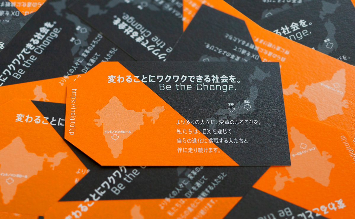
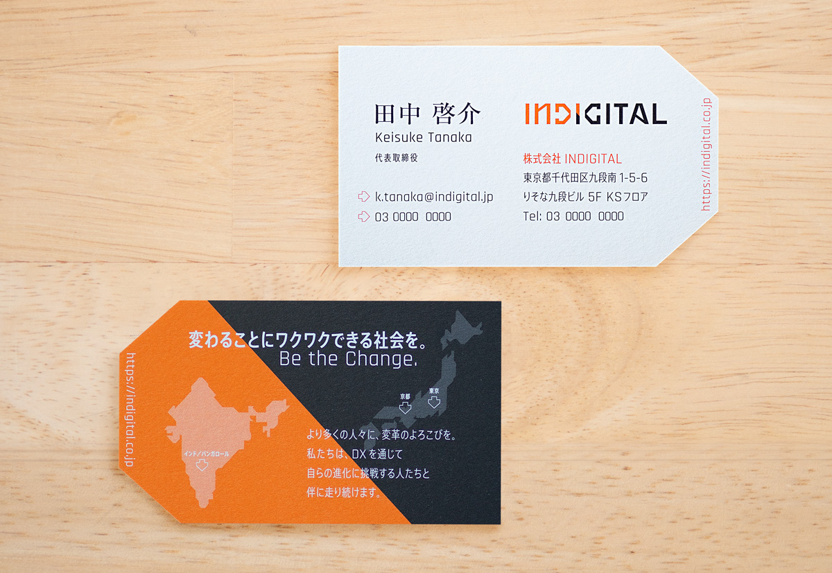
Client : INDIGITAL(東京・京都・インド/バンガロール)
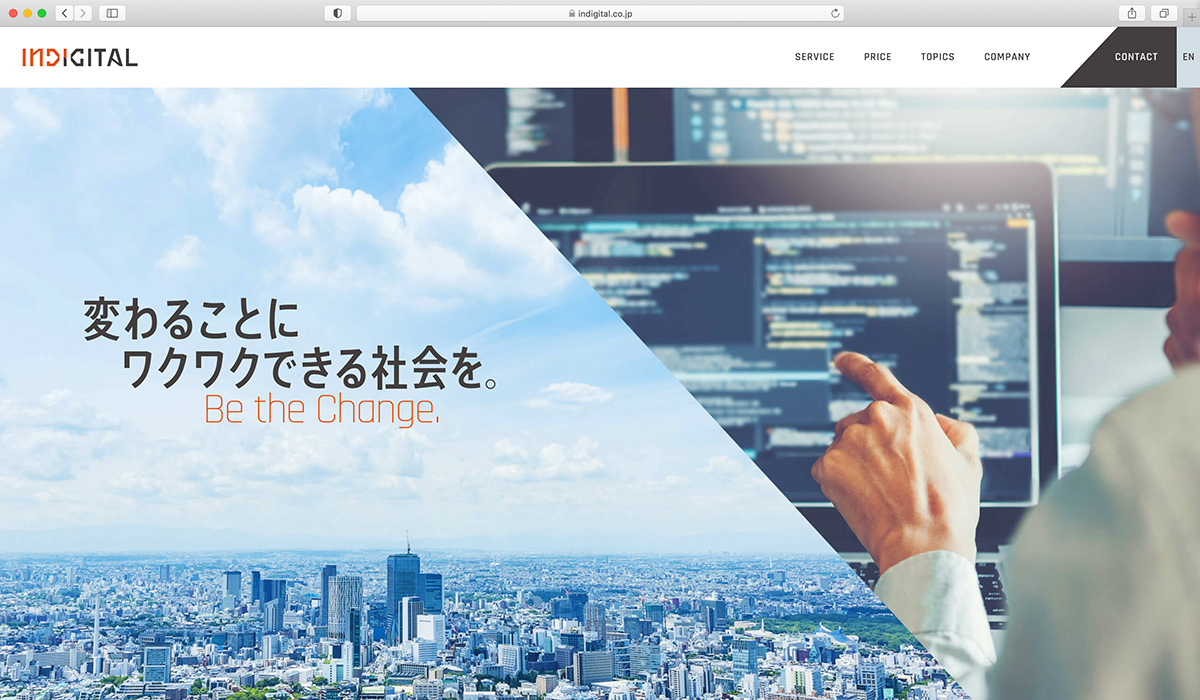
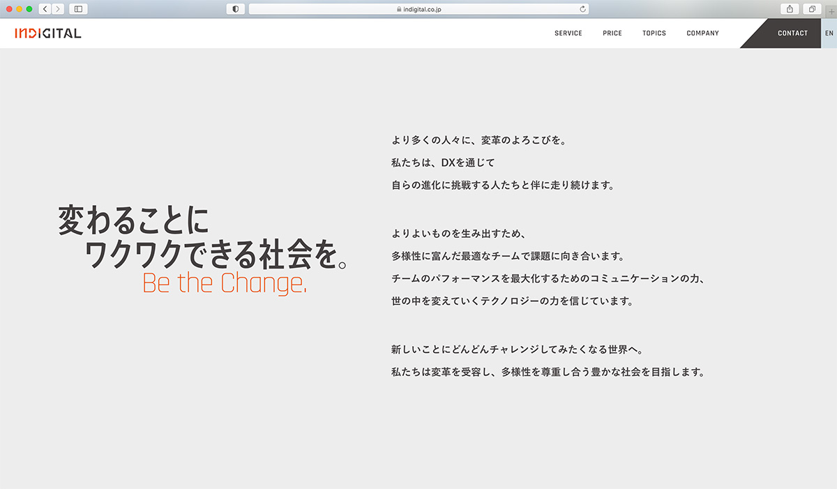
INDIGITALは、インドとデジタルを掛け合わせた造語から生まれました。
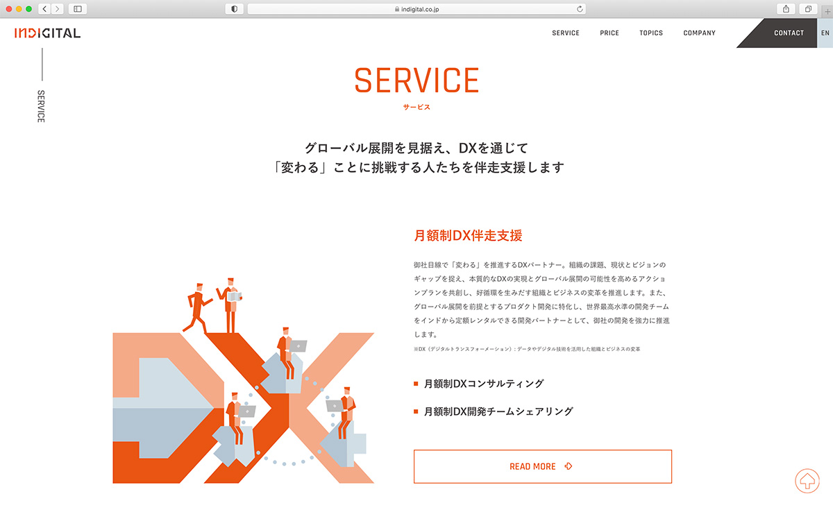
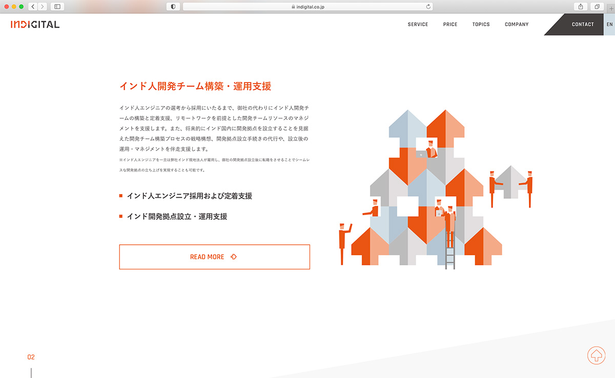
DXを通じて自ら進化に挑戦する人たちを開発や採用、運用面でサポートするサービスを提供します。
最大の特徴は、IT先進国インドから、日本企業のDXや海外展開をサポートする点にあります。
企業は、日本にいながら日本語のみで、インドの優秀な開発チームとDXを勧めることができます。
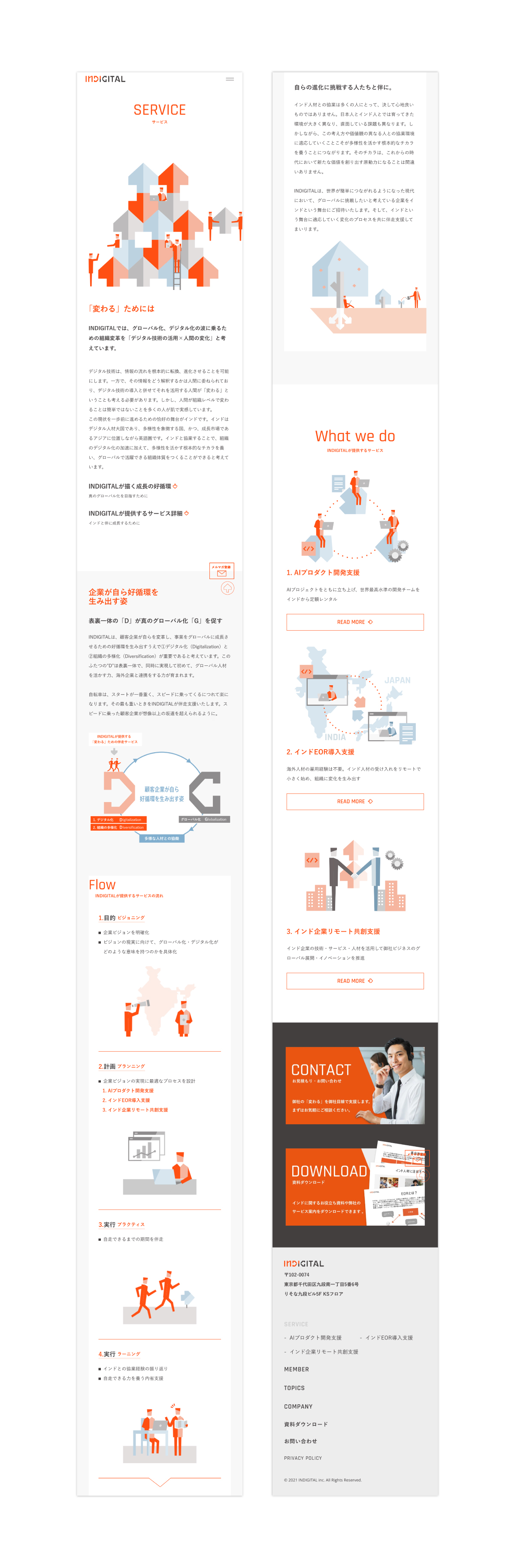
ロゴマークは、DとGの中に矢印があり、向き合うようなデザインにしました。
インドと日本が向き合う矢印と矢印の間に存在し、橋渡しをするのがINDIGITALであることを表現しています。
https://indigital.co.jp
It is a service that supports the development, hiring, and operation of people who are challenging their own evolution through DX.
The greatest feature of this service is that it supports the DX and overseas expansion of Japanese companies from India, a leading IT country.
Companies will be able to work with India’s talented development teams to promote DX while in Japan, using only Japanese.
The name INDIGITAL was coined from a combination of the words “India” and “digital”.
The logo is designed to have an arrow inside the “D” and “G”, facing each other.
It expresses that INDIGITAL exists between the arrows facing India and Japan, and that it is INDIGITAL that bridges the gap.
- Printing Info
-
<名刺>Size:W91×H55mm)/用紙:Mr.A/印刷:両面3c 特オレンジ、特墨銀、特ニス/加工:トムソン抜き加工
- Credit
-
Web Cording: ピクチャレスク
Print: GRAPH、EP